
Overview
Role
Lead UI/UX Designer
Timeline
April 2024 (~1 Month)
Data Analytics Dashboard Redesign
Background
The Data Analytics team at Surge Staffing identified a need to modernize the visual design of their executive-facing Power BI dashboards. I partnered closely with the team to assess the current state of the dashboards, learn who uses them, and understand their purpose and value to the organization. With these insights, I redesigned the dashboards’ UI to deliver a more seamless and engaging experience for our executive users—while staying aligned with Surge Staffing’s established brand guidelines and color palette.
Tools
Figma
* Disclaimer
To maintain confidentiality, all client names, industry identifiers, company logos, and numerical data displayed in these dashboard visuals have been modified, removed, or replaced. The designs presented are solely intended to showcase visual design and user experience improvements.
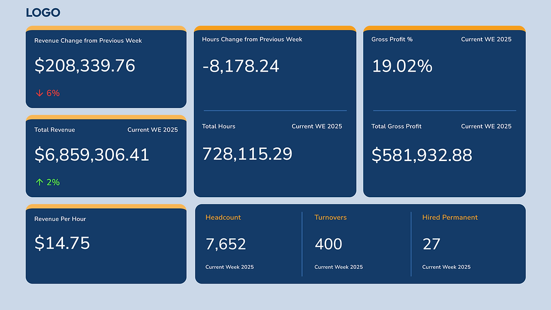
Executive Overview Dashboard
Description: A high-level snapshot designed for quick insights into weekly performance metrics. Featuring revenue trends, gross profit, workforce statistics, and key operational changes at a glance.
%20-%20MG.png)
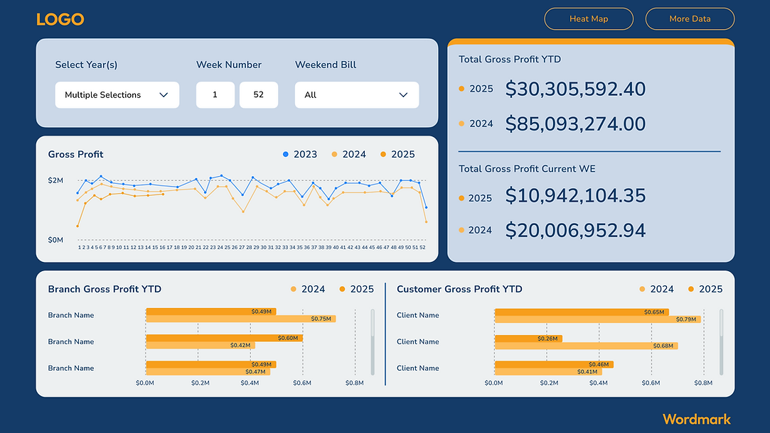
Revenue & Hours Dashboard
Description: Offers a detailed view of total revenue and hours worked, with breakdowns by branch and customer, enabling deeper analysis by time period and performance segmentation.
%20-%20MG.png)
Total Revenue by Corporate Entity Dashboard
Description: Displays overall revenue totals with a focused breakdown by corporate entity, helping stakeholders compare performance across organizational divisions over time.
%20-%20MG.png)
Year-to-Date & Weekly Revenue Trends Dashboard
Description: Compares year-over-year revenue performance with current weekly totals, while visualizing weekly revenue changes and YTD breakdowns by branch and customer.
%20-%20MG.png)
Year-to-Date Gross Profit Dashboard
Description: Highlights gross profit performance with YTD and weekly comparisons between 2024 and 2025, supported by historical trends and breakdowns by branch and customer.
%20-%20MG.png)
Year-to-Date Gross Profit % Dashboard
Description: Tracks gross profit percentage with YTD and weekly comparisons across 2024 and 2025, along with historical trends and detailed views by branch and customer.
%20-%20MG.png)
Year-to-Date Total Hours Dashboard
Description: Presents YTD and weekly total hours worked with comparisons across 2024 and 2025, including weekly trends and breakdowns by branch and customer.
%20-%20MG.png)
Headcount Overview Dashboard
Description: Displays monthly and current week headcount with year-over-year trends, plus detailed views of current week headcount by customer and branch.
%20-%20MG.png)
Turnover Overview Dashboard
Description: Shows monthly and current week turnover metrics with historical comparisons, alongside current week turnover breakdowns by customer and branch.
%20-%20MG.png)
Permanent Hires Overview Dashboard
Description: Highlights monthly and current week permanent hire data with year-over-year trends, plus current week breakdowns by customer and branch.
%20-%20MG.png)
Revenue by Industry Dashboard
Description: Displays total YTD revenue with a detailed breakdown by industry, using dot and bar charts to uncover performance trends across market sectors.
%20-%20MG.png)
Branches Filing Customers Dashboard
Description: Provides a customer directory with key details like headcount, branch, account type, status, and industry, offering insight into active customer distribution and engagement.
%20-%20MG.png)