Overview
Role
Lead UI/UX Designer
Timeline
November 2024 - Present
Tools
Figma
Adobe Photoshop
Adobe After Effects
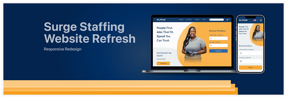
SURGE Staffing
Website Refresh
Background
As the sole UI/UX Designer, I led a complete redesign of surgestaffing.com, creating 90+ fully responsive desktop and mobile pages. I owned the entire process, from information architecture to developer-ready handoff, focusing on usability, accessibility, and modern UX standards. The result: a more intuitive, engaging experience for both job seekers and employers.
Problem
Job seekers and clients need an intuitive, accessible platform to efficiently find jobs or fill open roles—helping them succeed in securing employment or meeting staffing demands.
Goals & Objectives
-
Improve overall usability and accessibility to ensure all users can navigate the site efficiently across devices and assistive technologies.
-
Modernize the visual design and layout to create a clean, professional interface aligned with current UX/UI standards.
-
Establish consistency and clarity across the platform through a scalable, responsive design system that supports both user and business needs.
-
Enhance the job search and application experience to support job seekers in finding and applying for roles with ease.
Challenges
-
Full design ownership: This was my first project where I was solely responsible for the entire end-to-end design process.
-
Limited direction and feedback: At times, the lack of clear guidance required me to be highly self-directed and proactive in decision-making.
-
No structured process: With no formal planning framework in place, I had to create my own workflows to keep the project moving efficiently.
-
Restricted resources: Tight timelines and no budget for additional user research required creative problem-solving to gather insights.
-
Creative constraints: Pre-established brand colors made it challenging to craft accessible yet visually appealing color combinations.
The Solution
A comprehensive, fully responsive website redesign focused on delivering a seamless experience for both job seekers and clients. The new site has enhanced usability, accessibility, and a modern, consistent visual design paired with intuitive interactions.
-
Mobile-first approach: Prioritized mobile design based on analytics showing 78% of users access the site via mobile.
-
Dual user focus: Crafted to equally serve the needs of both talent seekers and job seekers.
-
Personalized experiences: Incorporated customization where possible to make the site feel tailored to each user.

Design Process
Discover & Empathize
Deeply understand users’ perspectives, pain points, and motivations.
Competitive Audit
I conducted a competitive audit of 11 leading competitors in a crowded market to analyze the current landscape and uncover opportunities for improvement. These insights ensured the redesigned website not only addressed user needs but also delivered a stronger, more competitive experience that stands out in the industry.
.png)
How Might We

Define
Articulate the problem to be solved, aligning business and user needs.
Problem Statement
I created user journey maps for both job seekers and talent seekers, based on the personas Anna and Troy, to visualize their experiences, uncover pain points, and identify key needs to guide the design process going forward.
User Personas
I created two user personas, one representing the job seeker group and another representing the talent seeker group, to ensure both sides of our user base were accurately represented and integrated throughout the design process.
Job Seeker: Anna
Goal: Quickly find and apply to local, flexible jobs that fit her schedule and short-term income needs.

Talent Seeker: Troy
Goal: Efficiently request and secure a large number of skilled workers to meet tight project timelines.

Empathy Mapping
I created two user personas, one representing the job seeker group and another representing the talent seeker group, to ensure both sides of our user base were accurately represented and integrated throughout the design process.
Ideate
Explore a various quantity of possible solutions.
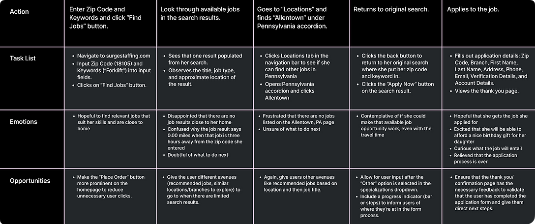
User Journey Mapping
I created user journey maps for both job seekers and talent seekers, based on the personas Anna and Troy, to visualize their experiences, uncover pain points, and identify key needs to guide the design process going forward.
Job Seeker: Anna
Goal: Quickly find and apply to local, flexible jobs that fit her schedule and short-term income needs.
Scenario: Anna, a forklift operator, wants to earn extra income over the next few months to buy her daughter a special birthday gift. She’s looking for temporary work that’s close to home and offers flexible hours.
%20(Case%20Study).png)
Talent Seeker: Troy
Goal: Efficiently request and secure a large number of skilled workers to meet tight project timelines.
Scenario: Troy, a construction site manager, has been assigned to oversee a new office building project set to begin in two weeks. To ensure the project runs efficiently, he needs to quickly secure 200 qualified workers for the job and place the staffing request immediately.
%20(Case%20Study).png)
Sitemap
The updated sitemap introduces a clearer, more intuitive structure that streamlines navigation and reduces friction, making it easier for users to quickly find what they need.

Old Sitemap

Refresh Sitemap
Design & Accessibility
Translate a balance of user and business needs into a tangible design solution.
Mockups
Mobile
I designed a visually cohesive, engaging, and consistent set of mobile screens by leveraging a custom component library I built in Figma alongside this project. This ensured uniformity across the entire mobile experience while ensuring streamlined future design updates and ease maintaining brand consistency.

Desktop
Using the fully responsive component library I built, I ensured the desktop experience maintained the same visual consistency and cohesive aesthetic as the mobile design. This approach created a seamless, unified look and feel across all screen sizes.

Hi-Fi Prototype
Before & After

Mobile: Grouped links, improved hierarchy, feedback, and language support.
Desktop: Cleaner layout, simplified structure, and functional flag icon.
Why this helps users
-
Language access improves inclusivity for our diverse user base.
-
Streamlined navigation reduces cognitive load and speeds up task completion.
-
Modern, intuitive inputs with enhanced visual design and interactivity.
Going Forward
Thinking long term and future project iterations.
Impact
-
Delivered a completely redesigned, rebranded, and fully responsive website featuring a consistent visual language, defined typographic hierarchy, and improved user experience that addresses key pain points.
-
Established a strong foundational design system that accelerates future design work, enhances scalability, and saves the company time, money, and resources.
-
Improved accessibility and inclusivity through WCAG-compliant design choices and the integration of an accessibility plugin to better serve a diverse user base.
* Google Analytics results to be added post-launch of the first iteration (August 8th, 2025).
What I learned
-
Confidence as a UX leader and SME: Learned to advocate for User Experience Design as a critical part of software and product development, ensuring it had a prominent seat at the table.
-
Independent project ownership: Gained experience managing tight timelines and prioritizing design deliverables for a large-scale project completely on my own.
-
Balancing perspectives: Learned to effectively align user needs, stakeholder input, and business objectives throughout the design process.
-
Progress over perfection: Focused on delivering meaningful UX improvements over pixel-perfect screens, prioritizing impact and usability.
Next Steps
-
Ongoing improvements: Continue owning the project by refining visual design, interaction patterns, user flows, and overall experience based on user research and data insights.
-
Design system growth: Expand the design system in future iterations to strengthen visual consistency, increase potential scalability, and improve efficiency in the company’s design process.
-
Measure and optimize: Leverage Google Analytics post-launch of iteration one to evaluate KPIs such as Task Success Rate, Time on Task, and User Error Rate. Consider conducting NPS or SUS surveys to gauge overall user satisfaction and guide future enhancements.
