Overview
Role
Lead UI/UX Designer
-
User Research
-
Sketching
-
Wireframing
-
User Flows
-
Visual Design
-
Interaction Design
-
Developer Handoff
Timeline
February 2025 - April 2025
Tools
Figma
Adobe Photoshop
Platforms
iOS
Columbia Woodlands Mobile App
Background
I designed a mobile app for guests of Columbia Woodlands, a luxury cabin rental property in Dover, Ohio. The goal was to elevate the guest experience through a user-friendly, intuitive digital companion.
The app includes account creation, real-time messaging (guest and admin views), detailed cabin info, and highlights amenities like wine tastings, yoga, hiking, spa services, and more. It blends functionality and visual storytelling to enhance both the digital and on-site experience.
Problem
Columbia Woodlands guests lack a convenient, digital way to explore amenities, communicate with staff, and enhance their stay, leading to missed opportunities to bridge the gap between the physical and digital guest experience.
Goals & Objectives
-
Create an accessible UI, optimized for mobile devices and varying user needs.
-
Deliver a seamless blend of usability, storytelling, and brand cohesion in the final product.
-
Streamline communication between guests and staff through intuitive real-time messaging.
-
Enhance the guest experience by providing a digital companion that aligns with the luxury and charm of Columbia Woodlands.
Challenges
The Solution
-
Balancing creativity with usability: Strived to craft a fresh, visually distinct interface that aligned with the brand while ensuring a seamless, highly usable experience.
-
Vague and evolving requirements: Faced inconsistent direction and shifting expectations, requiring flexibility and quick design pivots.
-
Limited access to real users: Unable to conduct formal user research or usability testing due to time and resource constraints.
-
Tight timelines: Completed all key phases of the UX process, from sketches and wireframes to high-fidelity mockups, under significant time pressure.
A thoughtfully designed iOS mobile app with usability and user experience at its core. The interface is built with pixel-perfect UI components, a cohesive green color palette, intentional typographic hierarchy, intuitive navigation, and clean, readable iconography.
The app simplifies key user tasks such as:
Creating an account or logging in
Exploring CWs’ luxury cabins and glamping tents
Discovering on-site amenities and experiences
Messaging the concierge directly for personalized service


Discover & Empathize
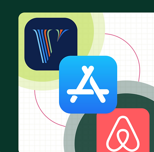
Competitor Research
Due to extremely limited time and resource availability, I wasn’t able to conduct hands-on user research for this project. Instead, I analyzed both positive (5-star) and negative (1-star) reviews from the Vrbo and Airbnb mobile apps on the Apple App Store to better understand the property rental app landscape. Using a cluster sorting method, I categorized recurring themes, pain points, and gain points to uncover actionable insights and identify key touch points with opportunities for improvement.
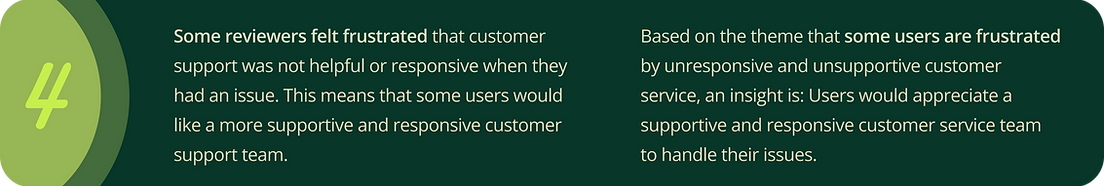
Patterns & Themes
Actionable Insights


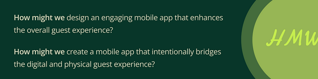
How Might We
Define
Problem Statement
Columbia Woodlands guests lack a convenient, digital way to explore amenities, communicate with staff, and enhance their stay, leading to missed opportunities to bridge the gap between the physical and digital guest experience.
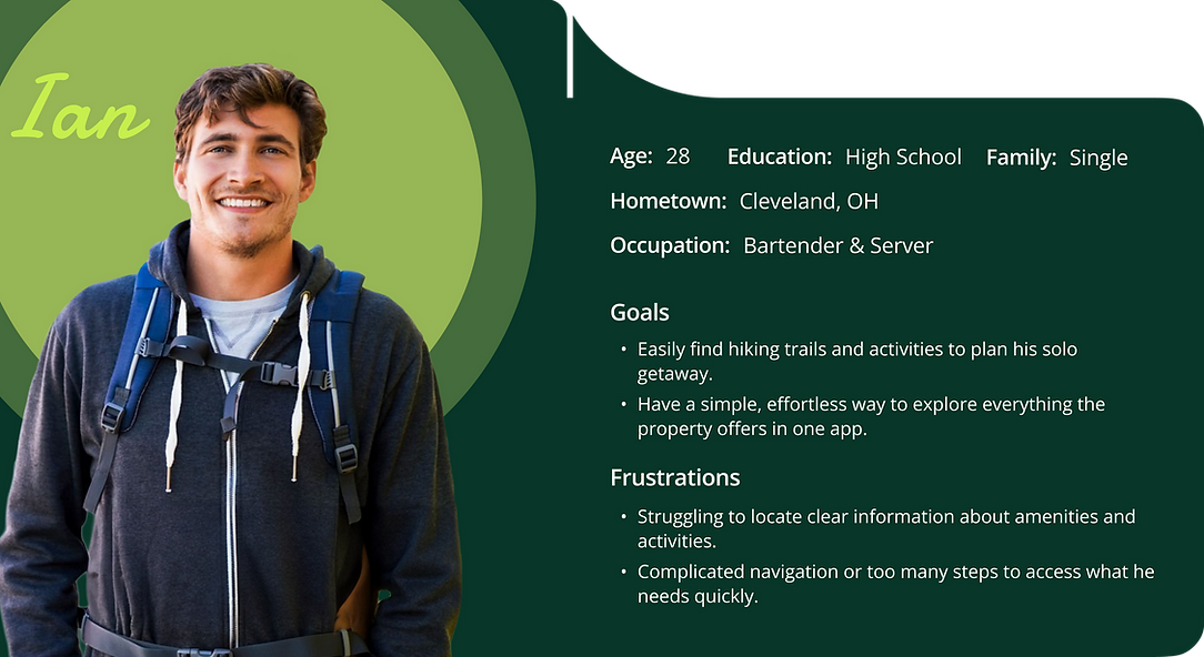
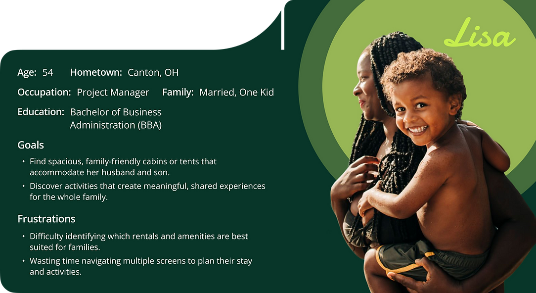
User Personas
Empathy Mapping
I built the empathy map using insights from my user personas and competitive research to visualize what is known about users’ thoughts, feelings, and actions. This exercise helped me better understand user perspectives and needs, guiding more user-centered design decisions throughout the project.

Ideate
Sitemap

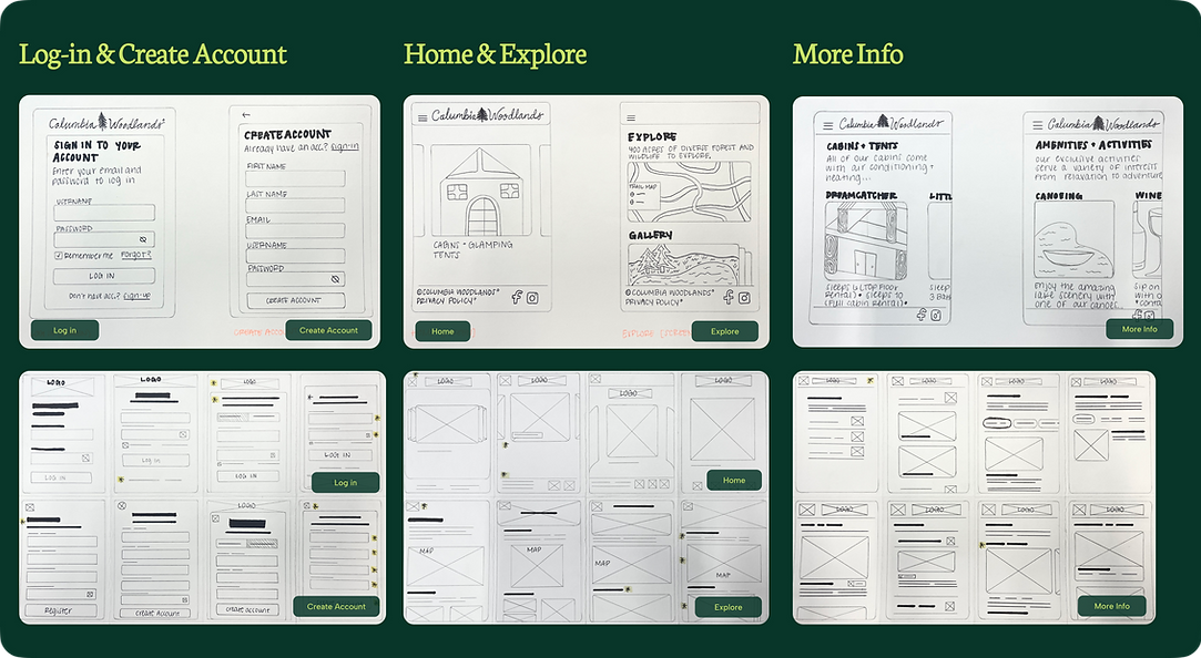
Sketching

Design
Color Palette
Sure, the colors are beautiful, but the choice of green goes deeper than aesthetics. Green evokes peace, relaxation, and a sense of security, emotions that align perfectly with the Columbia Woodlands vibe.
Deeper greens suggest luxury and exclusivity, while lighter tones add a sense of vitality and playfulness. Together, they strike a balance that reflects the brand’s harmony with nature and it’s commitment to both comfort and rejuvenation.

Typography
Damion
Damion is a playful and sincere script font. With rounded terminals and vintage flair, it's designed for display use.
Playfair Display
Playfair Display is a traditional serif font. It’s elegant design brings the perfect luxurious element into the typeface choices of Columbia Woodlands.
Albert Sans
Albert Sans is a modern & clean font, designed with clarity and readability in mind, making it a great choice for a versatile and expressive body text.

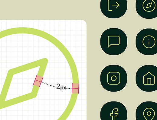
Iconography
-
Leveraged the open-source Feather icon library to maintain a clean, consistent look and feel.
-
Selected universal icons (e.g., phone, home, info) with high readability, simplicity, and clarity to promote familiarity and support intuitive navigation.
-
Ensured visual consistency by using a 2px stroke weight for 24px icons, scaling the stroke proportionally with larger icon sizes.
-
Integrated icons thoughtfully to complement the overall design and enhance the user experience without distraction.
Mockups
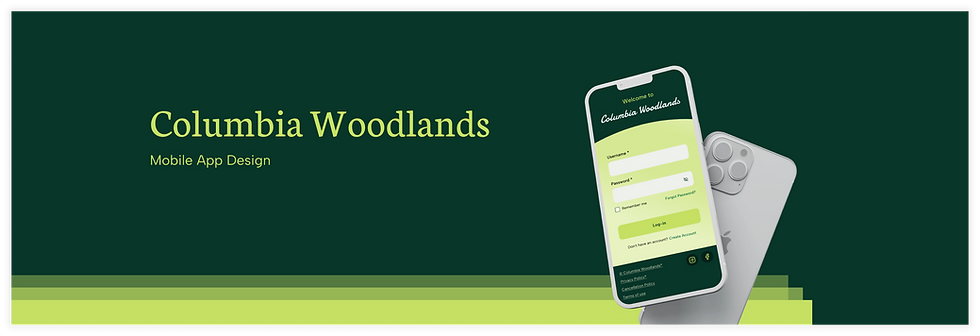
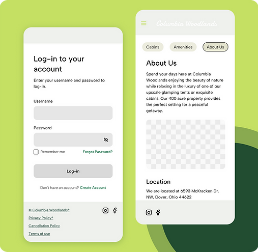
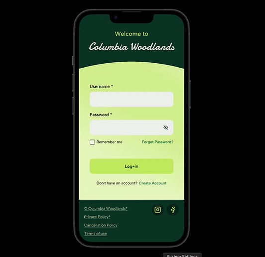
Log in
-
A simple, intuitive, and visually appealing log-in screen that welcomes user’s to the app.
-
Designed with intention, knowing the log-in screen sets the tone as the user’s first impression of the brand.

Accessibility Considerations
Usability and inclusivity were top priorities throughout the entire design process. I focused on implementing accessible color contrast and clear typographic structure to ensure the app could be used comfortably by a wide range of users. Every visual and text element was crafted with WCAG standards in mind, supporting readability, legibility, and an overall more inclusive user experience.


Color Contrast
To ensure a more inclusive and visually clear experience for all users, I used accessible color combinations with high contrast ratios throughout the app. Using Figma’s Color Contrast Checker, I verified that all color pairings met WCAG AAA compliance, the highest standard for accessibility.
Text Size & Typography
I established a clear typographic scale aligned with WCAG guidelines to ensure legibility across screens. Body text was set at 16px or larger, with a line height of 1.5× to enhance spacing and readability. This hierarchy allows users to easily scan and interpret information, helping them navigate the app comfortably and without visual strain.
For the high-fidelity prototype, I transformed my pixel-perfect mockups into a fully interactive experience. Using Figma, I built dynamic, clickable components to simulate real user flows and bring the final design to life.


Low-Fidelity Prototype
For the high-fidelity prototype, I transformed my pixel-perfect mockups into a fully interactive experience. Using Figma, I built dynamic, clickable components to simulate real user flows and bring the final design to life.

High-Fidelity Prototype
Going Forward
Thinking long term and future project iterations.
Impact
-
Delivered a refined, user-friendly mobile experience with strong visual hierarchy and accessibility best practices, enhancing first impressions, simplifying exploration of cabins and amenities, and enabling direct contact with customer service.
-
Earned positive feedback from the CEO and internal stakeholders, who expressed strong interest in moving the design toward implementation.
-
Established a solid foundation for future scalability, including the potential development of a fully branded mobile booking experience.
What I learned
-
Gained valuable experience leading the end-to-end design process, from discovery and wireframing to high-fidelity prototyping and stakeholder presentation.
Deepened my understanding of designing for mobile-first experiences, including layout constraints and touch-target best practices. -
Strengthened my ability to integrate accessibility features from the ground up, ensuring a more inclusive design.
-
Improved communication skills by presenting design solutions to executive leadership and incorporating their input effectively.
Next Steps
-
Conduct a moderated usability study to gather real-time qualitative insights, uncover user motivations and behaviors, and help prioritize the next set of feature enhancements.
-
Measure ROI post-launch by tracking key performance indicators such as user engagement, satisfaction scores, and conversion metrics.
-
Expand the Figma design system to accelerate future iterations, improve consistency, and reduce design and development overhead.
-
Introduce advanced features like in-app booking and food service options to personalize the guest experience and drive higher user value.

.png)